

The first rule of review collection - if you don’t ask you don’t get. At least not the good stuff anyway. Whilst a disgruntled customer is all too often eager to share their experience online, the happy ones tend to need a gentle nudge. So if you want to up your positive review count, you need to get proactive.
The second rule of review collection - you need to figure out what your customers respond to in a review request. That means testing, tweaking and testing again until your response rates are through the roof.
With that in mind, we’re offering up our top tips for how to improve your review requests, and some suggestions on A/B tests to run for each point of focus.
A quick note about A/B testing: be sure to change just one variable at a time so you know exactly what you can attribute and significant improvement in conversion rates to.
Personalization is the first step towards a higher response rate for your review requests - simply because when a customer receives a message tailored specifically to them they’re more likely to engage with it.
It shows you care about the individual customer experience, which means as well as getting more reviews you’re also likely to get better quality content.
The best thing about personalization is that a small change can make a big difference. Some stats show that just personalizing the subject line increases email open rates by 26%, and since that’s your first hurdle it’s a good place to start.
It’s also incredibly easy to do if you send review requests through tools like Klaviyo or Dotdigital. With these, you can use dynamic tags to pull in information specific to each customer like their name and the product they purchased.
Test the use of customer name: try this out in the subject line and/or the body of the email.
Test the use of product name: try referencing the specific product, again in the subject line and/or the body of the email.
Test the level of personalization: should you personalize both subject line and email body or just one of those elements? Should you include both customer and product name, or does one yield better results than the other?
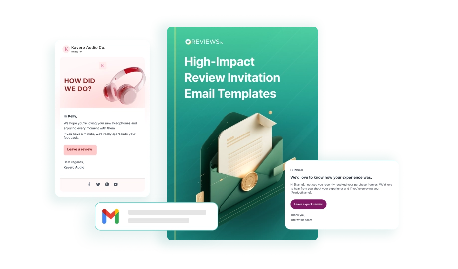
A review request is the start of a strong post purchase strategy, and it should continue the customer experience by seamlessly linking your brand identity. Use your established tone of voice and clearly brand your request emails.
It also needs to be short and to the point. Your customers are busy people, so make it clear what you’re asking them to do by using concise, simple language.
Avoid including anything that might detract from the purpose of the email. This isn’t the time for cross selling or making product recommendations. You want the customer fully focused on submitting a review.
Test the length of the email: you can experiment with the length of the email while still keeping it short. Try review requests with one, two, three or four sentences.
Test the use of images: does including an image of the purchased product increase response rates?
Test different brand tones: if you have slightly different tones for transactional and marketing emails, test to see which works best for review invitations.
When it comes to improving response rates, simplicity is key. If the desired action is unclear or the customer has to jump through hoops they’re going to lose interest.
Include a clear call to action button or link in your email. The message here should be straightforward and communicate exactly what you want the customer to do - something like ‘Leave a Review’ or ‘Rate this Product’.
Additionally, make sure the process for leaving a review is simple and easy to follow. Provide clear instructions and a direct link to the review page - don’t make customers search for it.
Test the wording of your CTA: subtle changes can make all the difference here. For example, ‘Rate this Product’ vs. ‘Rate Your Purchase’.
Test the design of the CTA: the color and size of a button, button vs. link, CTA placement - there’s multiple things to play around with here.
Test the process: what sees higher engagement with your customer base, a review request button or an in-email form?
If you want to encourage more review submissions, rewarding customers for their time and effort just makes sense. Whether it’s a discount on their next purchase or points associated with a loyalty program, when you add an incentive you give the customer another reason to engage.
It’s also a great way to generate better quality content, provided the reward on offer is representative of the effort. For example, you could award more points for video reviews since these take more effort on the customer’s part but showcase your products in a really powerful way.
If you’re running a tiered loyalty program, you could offer more points per review based on a customer’s status. That way, you’re encouraging high quality reviews from your biggest fans and strengthening their sense of loyalty in the process.
To experiment with incentives, try out our proprietary loyalty platform, Influence.io.
Test different incentives: run A/B tests using discount codes, loyalty points and special offers to see what hits the mark with your customers.
Test different reward levels: play around with the points offered or level of discount to find a balance between good response rates and profitability.
Test where you highlight the incentive: do you get better response rates if you include the reward in the subject line or the body of the email?
We can’t stress this point enough - if you want to get more people to respond to your review requests, you have to nail your timing. Send an invitation too soon and the customer may not have had time to fully experience the product. Too late and their experience may be a distant memory.
This will of course depend on the type of product you sell, so the perfect timing is very much brand specific.
You also want to consider things like a customer’s location if selling internationally. This will impact shipping times as well as the time of day your review request lands in their inbox if they’re in a different timezone. You can use our Flow tool here to set conditional sending rules based on a recipient’s geolocation.
Test different time intervals: try sending review requests at different intervals after the purchase date.
Test different times of day: there’s multiple studies that all have a different opinion on the best time of day for email engagement. Experiment to find what works best for you.
Test the impact of seasonality: you might find you get better response rates by shifting your timing at certain points in the year, like a longer interval over the Christmas holidays, or a shorter interval after BFCM.
No matter how spot on your review invitations are, not everyone that’s inclined to respond will do so at your first request - but they may well take action if you follow up.
All the same rules apply here. You want to keep these follow ups personal, short and to the point, and simple to act on. You also want to nail your timing. Most importantly, you want to be persuasive without being pushy.
Test different timings: just as with your initial review request, experiment with the timing of your follow ups.
Test different messages: it’s arguably harder to craft a well written message for a follow up than it is for the initial request. You could try a lighthearted approach vs. emphasizing how much you value customer feedback.
Test email vs. SMS: SMS requests tend to convert at a much higher rate making them a great option for follow ups. Check out our integration with Attentive for this.
By testing all the variables mentioned above, you can better determine what works for your brand, and ultimately use that information to optimize your review request strategy.
But there’s one more test you can run, and it’s probably the most valuable of them all.
Testing your current solution against other products on the market will help you determine which delivers the best results, and subsequently which offers the best value for money. To test REVIEWS.io out against your current provider, take advantage of our 14 day free trial.
If you’re already with us, we’re happy to support you with whatever A/B tests you want to run. Our Customer Success team is on hand to look through your current strategy and help implement tweaks to boost your review response rates.
Personalization, clarity, and simplicity drive higher response rates. When emails use the customer’s name, clear language, and a single focused CTA, customers are much more willing to engage.
A/B testing helps identify which subject lines, CTAs, timings, and tones produce the best results. Changing even one variable can reveal insights that dramatically improve response rates.
Sending a request before the customer has used the product lowers response rates and may lead to negative feedback. The right timing improves accuracy, sentiment, and conversion.
Yes - when applied ethically and fairly. Incentives like loyalty points or discounts can motivate customers to engage, especially when used for more effort-heavy formats like video reviews.


